4
 Cube shading tips
11 Nov 2020 16:58 by
✨😁🌵YӨ DΣΣMΣЯƧ🌵😁✨
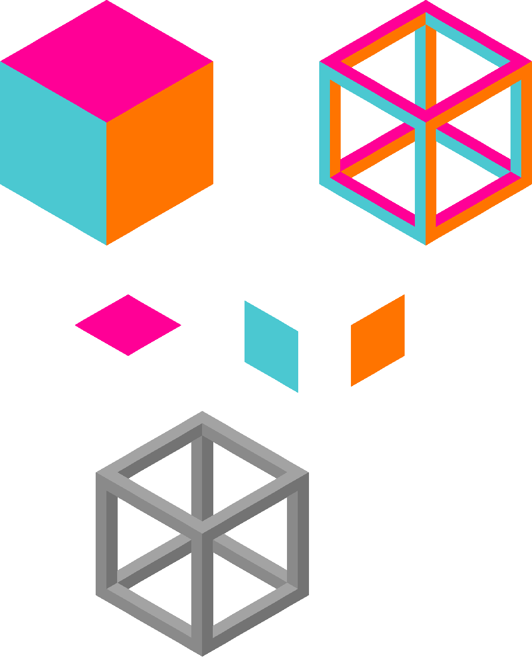
So, I decided to make this to show you guys how I shade my cubes. For the purpose of easily viewing the difference and seeing what goes where, I used different colours.
Pink - Top/Lightest shade
Blue - Left/Middle shade
Orange - Right/Darkest shade
I also drew out larger versions of the pixels to show you how they should look.
The grey cube at the bottom shows the same cube as above, but I replaced the colours with the colour I selected (grey). If it helps, you might want to start out by using different colours to differentiate the different shades, then replacing them after.
I hope this helps!