0
 near-final
25 Jun 2014 22:28 by
volodymyr.velyky
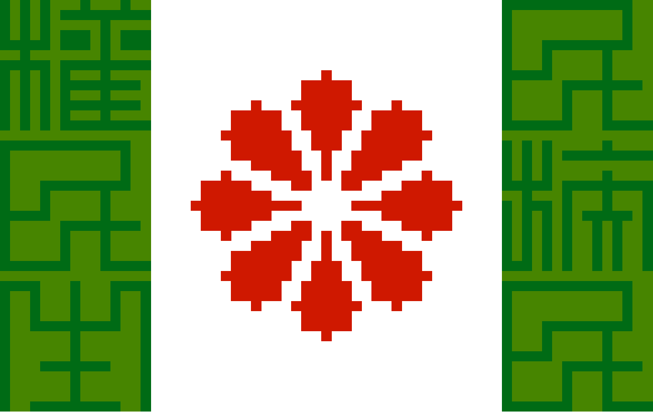
Improved heartflower +
massaged non-dumpy proportions +
three principles of the people in oblong seal script +
some attention to the shades of green.
But not enough. The greens need to be a good bit closer to each other, so differences in character density don't hurt so much. And I'd really rather the glyphs be off in a gold/yellow direction, and the field be nudged toward blue.